The design for flyhooks.org have been the same since the initial release almost 4 years ago. The design worked, but I’ve had a desire to change it for a while now, so with a couple of days available I sat down and cleaned up the design, added some better visual indicators and made it much better for mobile usage.
I have tried to keep it as minimalistic as possible, with focus on the hooks and information relating to the hooks. If you see any issues with the new design: please contact me here with a comment!

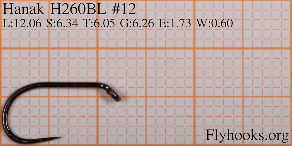
With the new design I also added over 100 new pictures and size information on hooks from Hanak.
Recent Comments